
The Invisible Salesman
The Psychology Behind Retail Design

Anthropology is the study of humans and the first time I heard this term was in an episode of “Community”. One day I was working the till and I sparked up a conversation with a customer. She had travelled from Seattle to visit family across the border, we got to talking and out of curiosity I asked what she did. She said “I’m an Anthropologist and work at Amazon”.
I was completely fascinated, she in short explained that she would track the mouse behaviour of users on their site, what traditional movements are and human behavioural analytics. I was enamoured with the concept and since have obsessed over learning more on this subject but for retail. When we think of experiments traditionally a rat in a maze, or a bunny with lipstick comes to mind. But a retail environment is engineered to influence how we move, what we notice, and ultimately what we buy.
1.) The Entrance
An easy example of this is the “right turn” concept, statistically 90% of people (in western countries) will turn right immediately after entering a store, it’s human nature. Now the interesting thing is, the first 5-15 feet of a store are known as the “decompression zone” and customers are adjusting from outdoors, to indoors. At this point of consumer experience they haven’t started to intake product information yet. Stores will aim to keep this zone decluttered, and transition through lighting and flooring. After a small “decompression zone” as explained above, the immediate right of entry will usually contain seasonal, high margin, and new arrivals.
2.) Store Design
For every 1% of dwell time, consumer spending increases on average by 1.3%(ShopperTrak), a concept that most store have accepted. Think, why are the most popular products are in the back of the store? Milk, cheese, eggs, etc. To increase time between purchases and increase cart size. Another common concept is the “race track” a popular design style Ikea has made famous, not allowing customers to naturally back track and to be forced to walk the entire store. The longer you are in there the more money you will spend. Some other conscious decisions are best sellers being on end caps, as a lack of products on shelves signals urgency to buyers, a scarcity factor. Same idea with cross selling sections, ketchup with mustard and mayo, pasta beside the pasta sauce. It’s not all for convenience but for their profits.
Now think of the sensory design around stores, like Abercrombie’s infamous scent, or when Starbucks CEO removed sandwiches from certain locations because it was overpowering the scent of coffee. Warm lighting, certain smells, all encourage consumer spending upon entrance, shopping, and exiting.
3.) The Exit
Did you know that checkouts account for 7% of total store sales in grocery? (Nielsen). The psychology and impact of a checkout station are so impactful its unbelievable. The final impression will determine repeat purchases, 70% of shoppers who have a “pleasant checkout experience” are more likely to return (Retail Customer Experience study). So making sure it’s organized and visually appealing are vital for memory encoding.
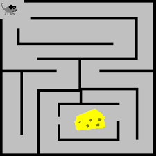
If I leave you with one thought, it’s this: retail design is the “invisible salesman” and every move you make both physically and financially is influenced, manipulated, and engineered behind the scenes. Like it or not, we’re all just rats in the maze.